
:Promos
UX · UI · Branding
Live prototype: Click here
Year: 2021
Background
A couple years ago, I was applying to a job listing. The employer requested me to do two design proposals in almost no time 😰 This is one of the two design tests I had to turn it in one week. Plus, I still had to keep up with my job from 9 to 5.
Challenge Accepted.
Overview
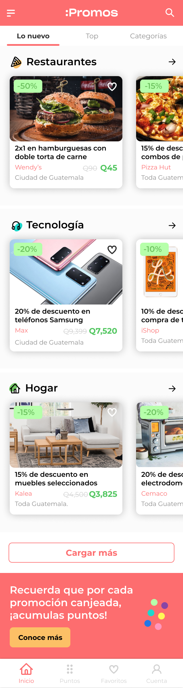
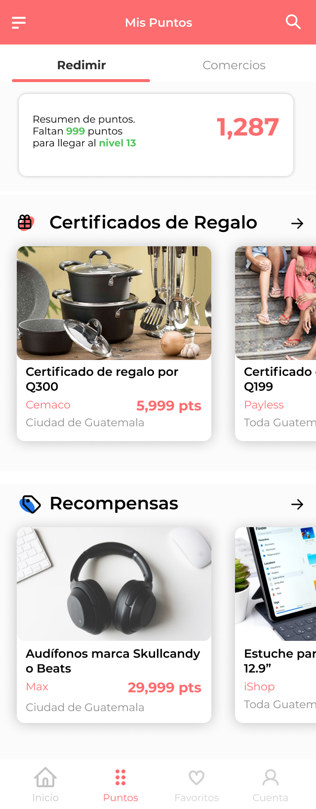
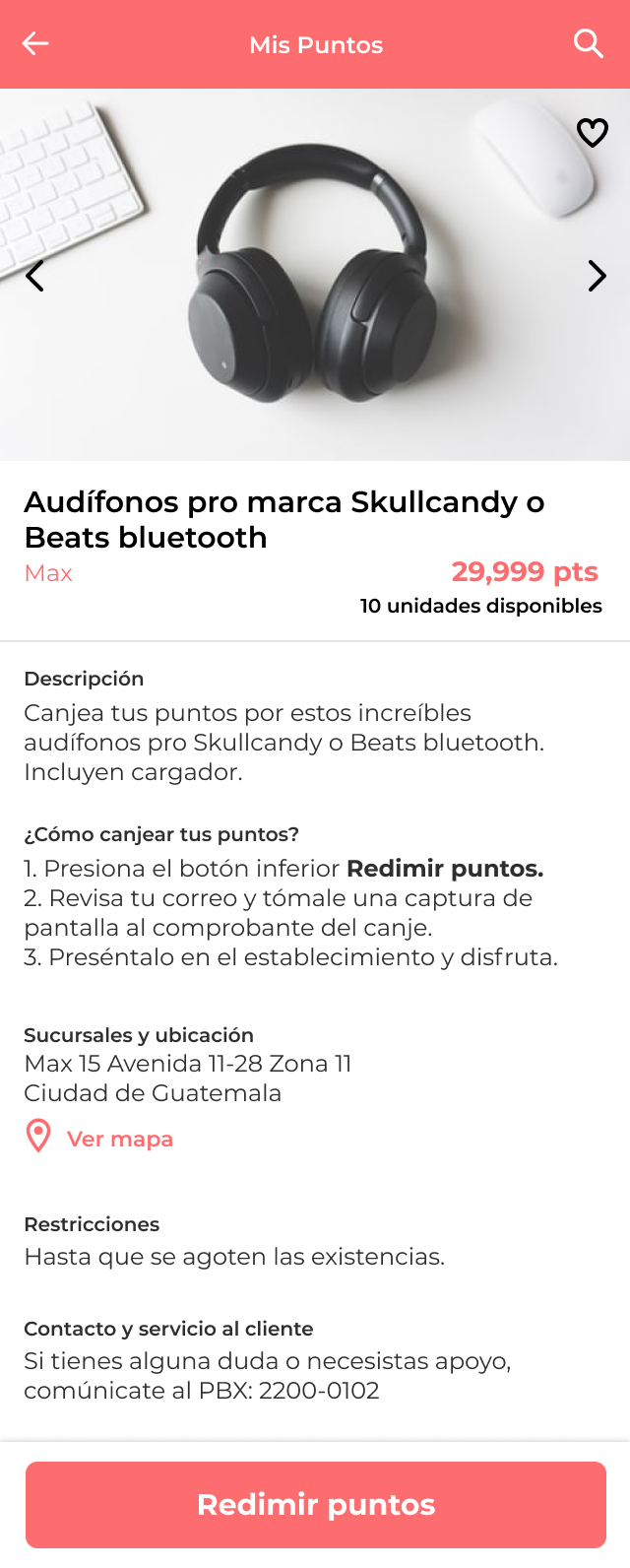
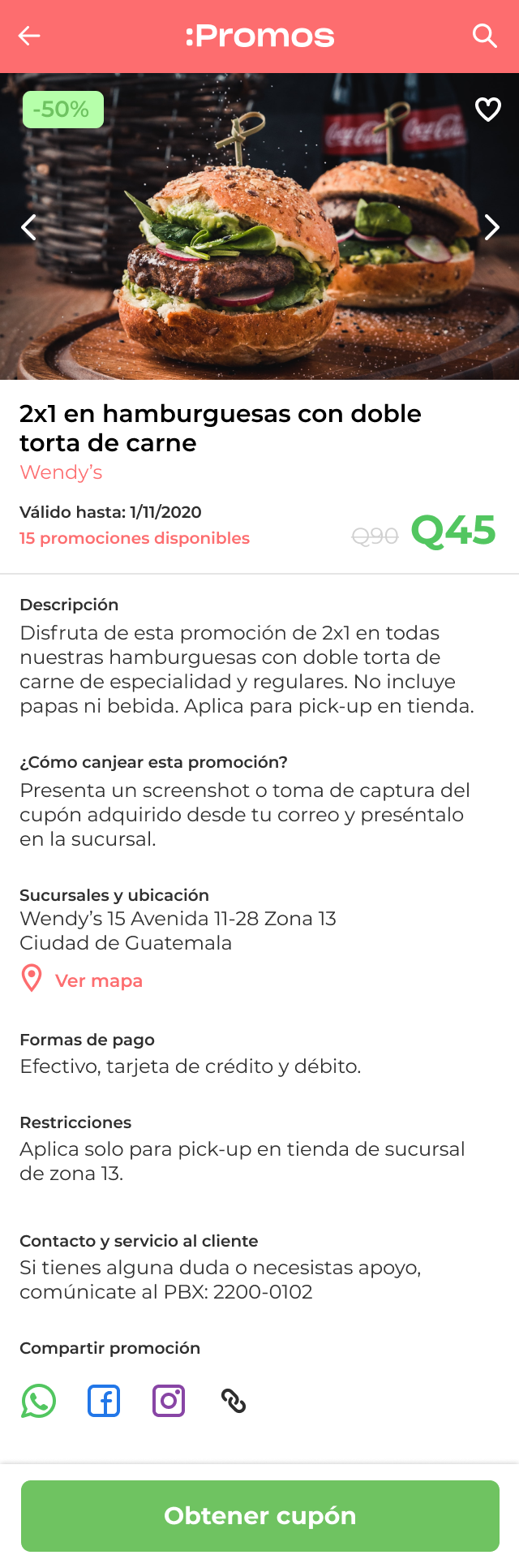
The assignment was the following: Design some screens for an app that focuses on delivering great valuable promotions, discounts and reward points that users can exchange for products or services.The client is a certain Guatemalan bank.
I had full creative control and direction for this, obviously. Also, a pitch deck with a fidelity strategy for the reward points was required.
Understanding the problem
See, I’m a big fan of e-commerce and fintechs, and these industries had to do with the type of client I was about to work with. Unfortunately, the employer did not provide helpful information about the potential users, limitations or any other guidelines.
The client’s current product (app) lacked essential factors that ensure a smooth user experience, starting with the following:
A good and understandable information architecture structure.
Organization and consistency
Friendly user interfaces.
For this proposal: a visual identity
The Process
I mapped a few competitors and did a quick benchmark, to kick off. To understand how this product should work and evaluate the pros and cons. Also, got some inspiration from popular apps that are mostly used in Guatemala.
Then moved on to elaborate a possible and organized information architecture within the app; “happy-path” focused, since timing was tight. Then, circled down key red routes along with a few express user stories so I could start picturing the entry points for certain flows.
I often choose to sketch manually the wireframming process, I find it faster and interesting and for some reason it helps me learn the paths and logic. All of these tasks took me around 2 days.
The very next day, I wanted to continue and brainstorm ideas for the visual identity. Something fresh, young and modern I thought. Defining the brand’s tone of voice helped me create a couple user personas profiles.
Branding
One or two things you need to know about Guatemalan consumers is that they rely on screenshots with important information because they do not like to read. That means if they see an explicit ad with a product and the price range in big bold letters they will still comment: “what’s the price?” “info please” or just “Price”. I like to believe we are not the only ones in this planet that do that 🤣. However, when something like a price or a point trading activity happens, they need to know all the info such as: the name of the commerce, locations, how to get there, is there parking?, stunning pictures, phone numbers, shipping, and so on and so forth. Crazy, isn’t it? But hey, at the end of the day they (I mean, we) just take a screenshot and contact the commerce later.
Key Takeaways
For features like this one, pictures must be real and at the same time presented in a delightful environment or a nice background. Promotions and deals must be attractive and meaningful; they must deliver great value to the users by being pocket friendly or giving them more than they usually get.